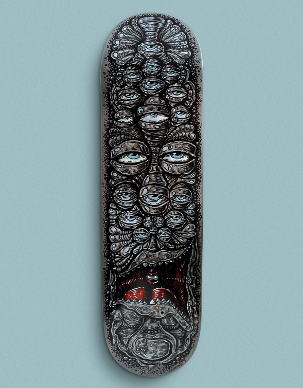
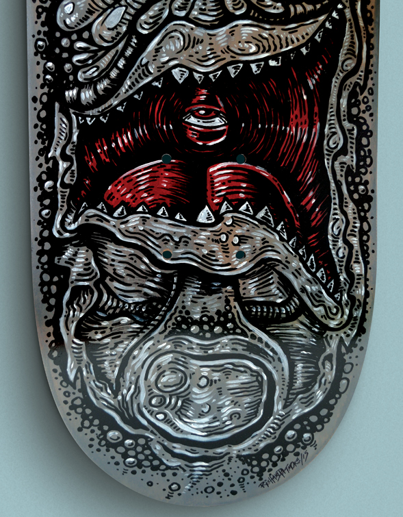
When I had the idea for this skate, I wanted to create something that had an ol’school feeling. For me one of the most memorable skate graphics of all time is the Rob Roskopp ‘Face’ by Jim Phillips. That deck has always stood out to me, huge, ugly, gnarly, crazed face. Iconic. I wanted to do something inspired by that deck. After sketching a bunch of faces this was the one I liked the most.
I stained the deck, hand painted the white, red and blue and did all the black line work with a sharpie. Really happy with the way this turned out.
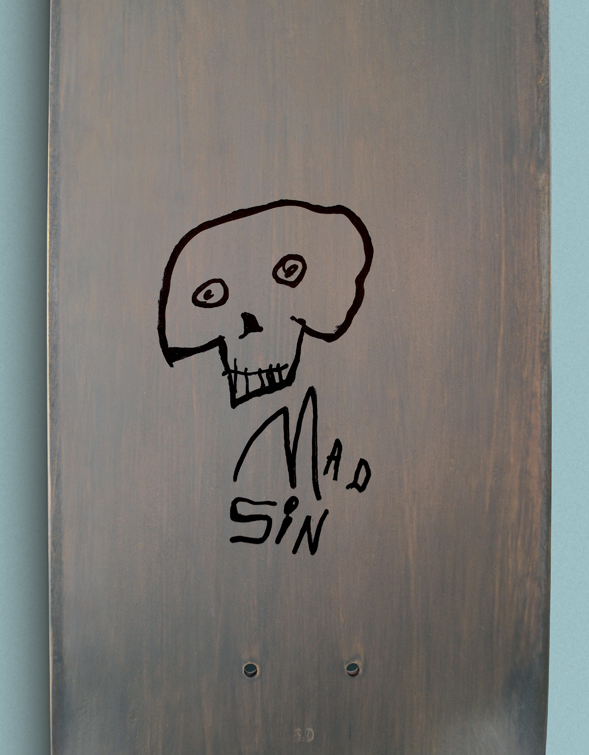
I’ve been toying with a skate company name called ‘Mad Sin’ inspired by my daughter’s name. I sketched a bunch of logos but ultimately thought the best logo would come from her. So I gave my four year old a black sharpie and asked her to draw me a logo on the skateboard. She nailed it, it’s become my favourite part of the deck. I love that it became a father / daughter piece.
‘Mad Sin’ logo illustrated by my four year old daughter.


