
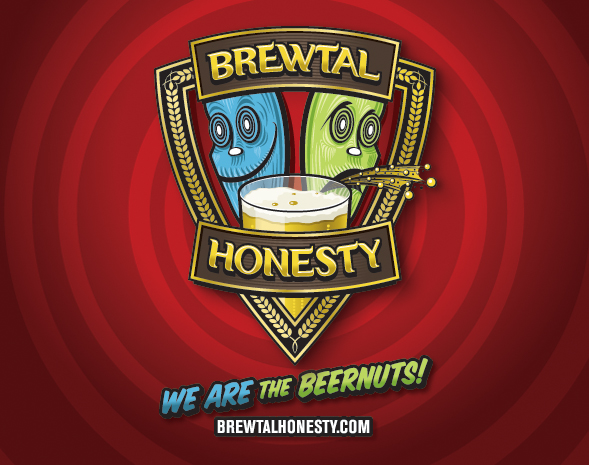

I’ve been thinking about this idea for a while. I know it’s not an original idea, but hopefully I’ll be doing it a bit differently. The idea behind the logo was to show two sides of beer drinking. You either love it or hate it. Hence the smiley face and the character vomiting. I wanted a logo that would be fun but look professional. To me trying different beers is exciting and can be humorous based on the people involved.
When I searched endlessly through fonts, I realized I wanted to create something special. So I created the type by hand. I also wanted characters in the logo for people to relate to but I didn’t want something normal. I wanted the characters to be a bit odd. I think that was achieved. ha ha.
Enjoy the show!